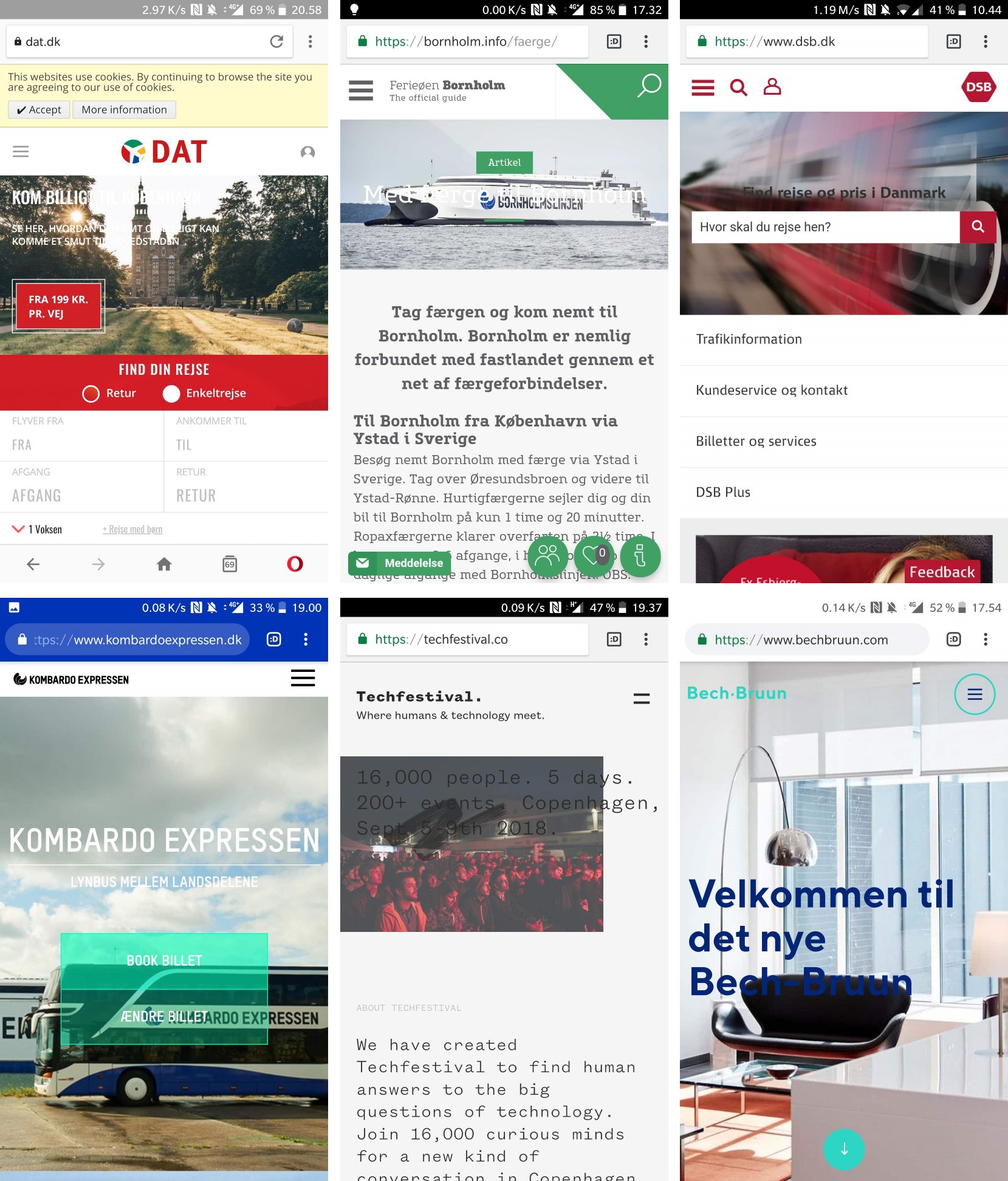
Legibility is often a subject when talking about accessibility – that is, ensuring your designs are usable for people with physical or cognitive disabilities. Typically according to WCAG standards. That's all well and good and something we as designers should definitely focus on.
However, it's a bit alarming to see just how many web designs are difficult to read due to poor contrast – even for people without (visual) disabilities.
Just have a look at the designs below, where the text on top of image backgrounds is quite hard or downright impossible to read.

I'm talking about this lack of contrast and poor legibility as a sin because the designers responsible really should know better.
From a UX perspective, there's an unfortunate trend in visual (digital) design to churn out "cool" designs with text overlays atop images without considering if the text is even readable.
Also, designs that might work on desktop, not necessarily work on mobile, where the relative size and position of background images and text changes.
Fortunately, there are quite easy fixes to these failed designs; like text shadows or (semi-transparent) different-color text backgrounds providing sufficient contrast.
Just have a look at this quick mockup of one of the design perpetrators pictured above:

In conclusion, my advice is to have a careful look at your designs to ensure proper basic legibility. If in doubt, you can use one of the many contrast checker tools online.
Also, if you need help spotting and fixing the "visual sins" in your designs, I'm here to assist.