I really like the Google Keep note-taking/todo list app. It's convenient, quick and generally easy to use.
However, it has an inconvenience in the design: It's in the details, but nevertheless it keeps (no pun intended) annoying and confusing me – and probably other users too.
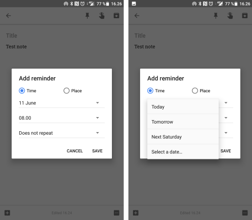
When setting a reminder on a note or todo list, the default reminder date is provided without sufficient context (whether it's today, tomorrow or some other date in near future). Furthermore, the possible confusion is magnified by the fact that the default reminder is set to tomorrow's date (instead of today's).
This always forces users to have today's date at the top of their mind and thus the design violates one of the fundamental guidelines of best practice user interface design:
— Recognition over recall
...which in this case means, that users would have an easier task of recognizing labels such as "today", or "tomorrow", rather than just a date, "June 11" without context.
In the current design (on Android at least), it looks as below (when tapping "11 June" in the left-hand screen, you get the right-hand screen):

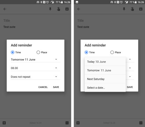
As a quick redesign exercise, I have improved the design by adding a proper, consistent labeling with date context (Today or Tomorrow):

It's a bit more verbose, but here clarity beats brevity. This way people don't have to recall or otherwise look up today's date to make sure they have set the reminder as intended.