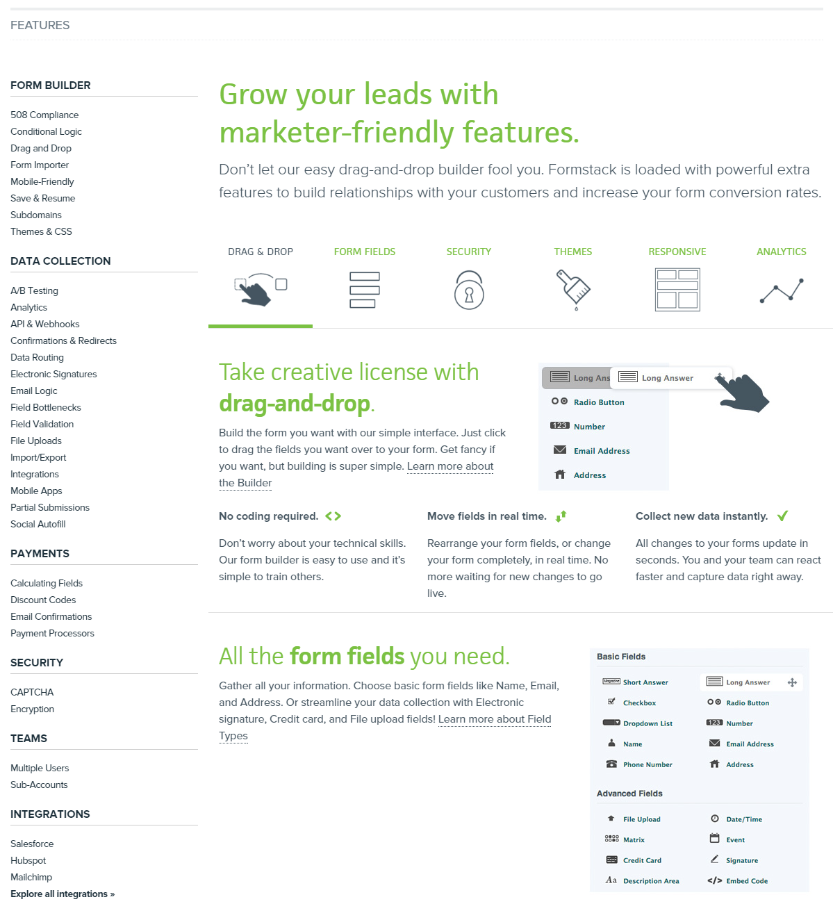
In the screenshot below, the row of six icons is actually navigation. Clicking each icon takes the user to a section further down the page.
However, it is hard to tell, since there are no sufficiently strong affordances (i.e. hints of interactivity).
Before:

After quick redesign:
