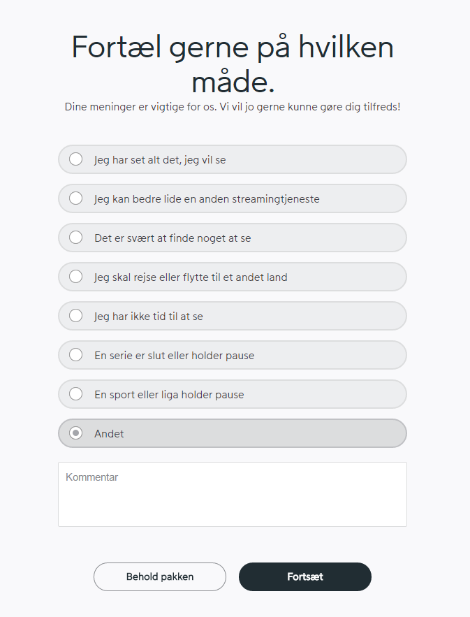
1. Don't hide important information
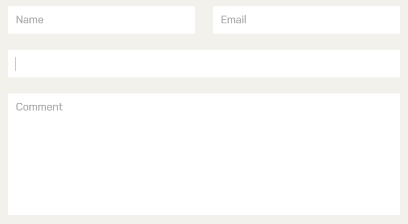
Don't hide the labels of input fields on focus:
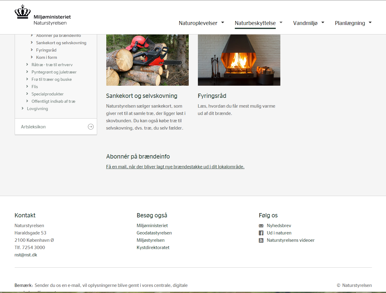
Don't make a fixed (non-scrolling) header take up too much space, thus hiding some of the important page content:
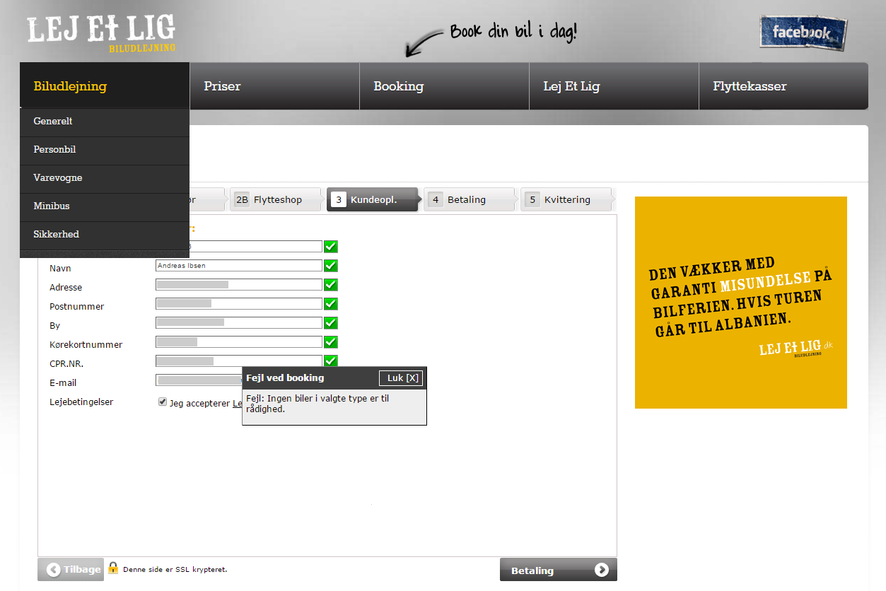
Don't wait until late in a booking/checkout flow to tell me that the requested goods or services are unavailable. I have entered all my personal details, when a dialog box tells me no rental cars are available:
2. Don't use ambiguous grouping
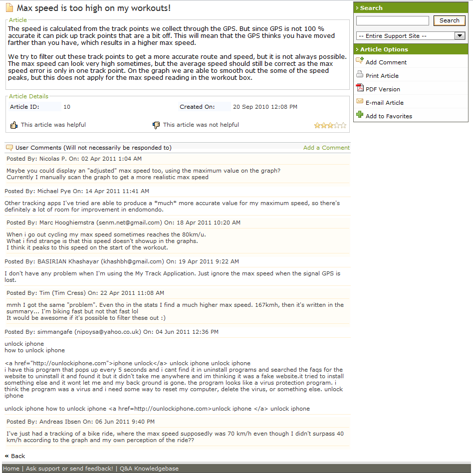
Due to a lack of sufficiently clear visual hierarchy and grouping this forum thread becomes hard to decipher:
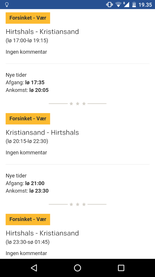
In the example below, the visual grouping of related info isn't clear due to the conflicting divider lines (thick lines with three stars versus thin hairlines):
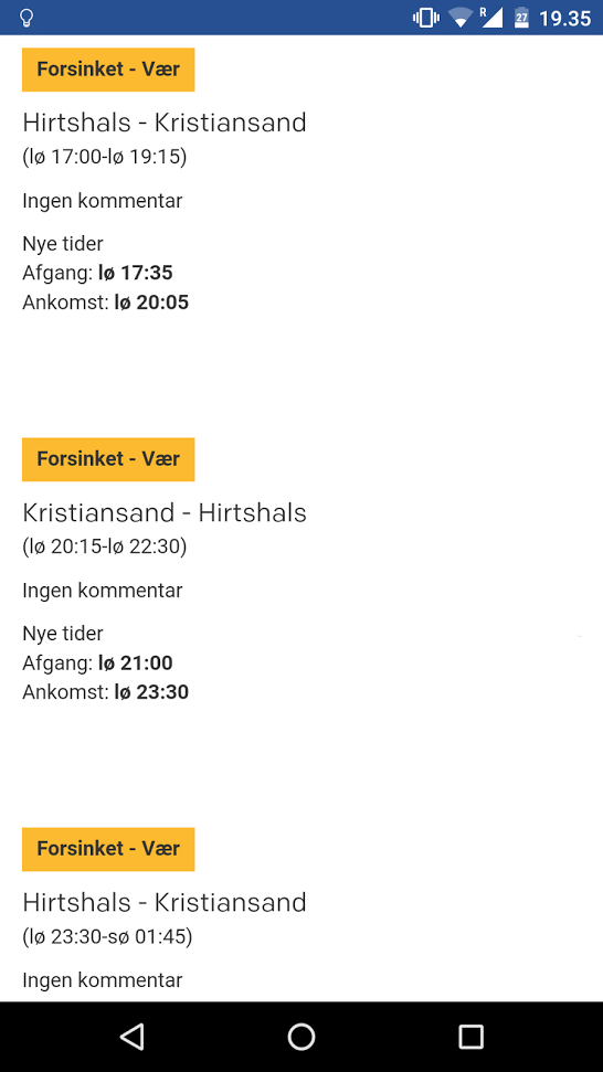
Below is a quick redesign with improved grouping:
3. Don't make UI elements look like something they're not
Don't make tabs look like text input boxes:

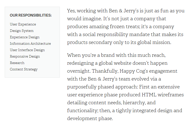
Don't make a non-clickable list in a sidebar look like navigation:
Bonus: An example to follow
After all these don'ts, let's end on a positive note :)
Do make radio buttons very easy to recognize and understand:
