The Challenge
Before redesign: A lot of issues
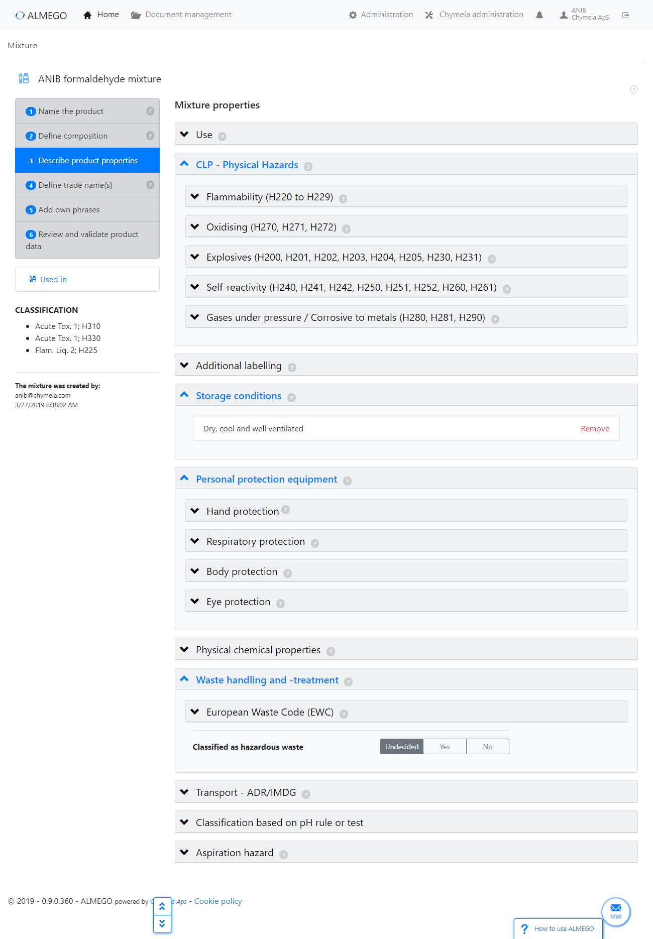
At the heart of Almego is a vast number of chemical properties which are either prefilled or edited by the users who are chemical specialists.Before I joined the Almego team, the chemical properties had been organized in multiple levels of nested expandable panels.
On the surface this seemed like a good idea, since it reflected the hierarchy and the initially closed panels would provide a good overview of top-level sections.
However, in reality, properties often proved hard to find: The constant opening and closing of panels, scrolling up and down, and in the process loosing track of where you were before and where you were heading next.
Key problems with existing design:
- Too much clicking to open or close panels
- A lot of scrolling up and down, with no persistent visual 'hooks' to hold on to (context cues scrolling out of view)
- If getting lost, you'd have to close all panels on the shortcut button and start all over
- No search or filter features (also due to technical constraints of the existing implementation)
- A lot of negative space not coming to good use
- An inconsistent, noisy and unrefined visual appearance
Compare with redesign below.
The Process
Ditch the nested panels, then what? Summary + Mega menus...?
It was clear to me quite early on that we had to ditch the nested panels, so I explored and sketched out different concept solutions trying out various layout and navigation designs.In the process I was inspired by the navigation concept of Miller columns, where each level in the hierarchy is represented by adjacent columns. However, that was abandoned since it could also lead to quite a lot of clicking back and forth – what NNGroup would call pogo sticking.
The illustration here is an intermediate concept design exploration featuring a summary of user edited properties in combination with a mega menu.
While the summary was an interesting idea, it would add an extra layer of redundancy covering up content when in use — so it didn't seem like the most efficient design.
Although a mega menu provides at-a-glance overview and quick navigation (according to NNGroup and others), it also had the drawback of not being sufficiently scalable (with new menu items being added in future updates).
In addition, there would be an uneven number of submenu items across main navigation items, making for an 'unbalanced' menu. In general, this design wasn't straightforward enough with too many layers.
Getting closer: Left-hand accordion menu + right hand details panel
An exploration of an accordion-style left-hand menu, in order to provide a quick, persistent overview of main navigation items and to prevent overwhelming the user with too much information at a time.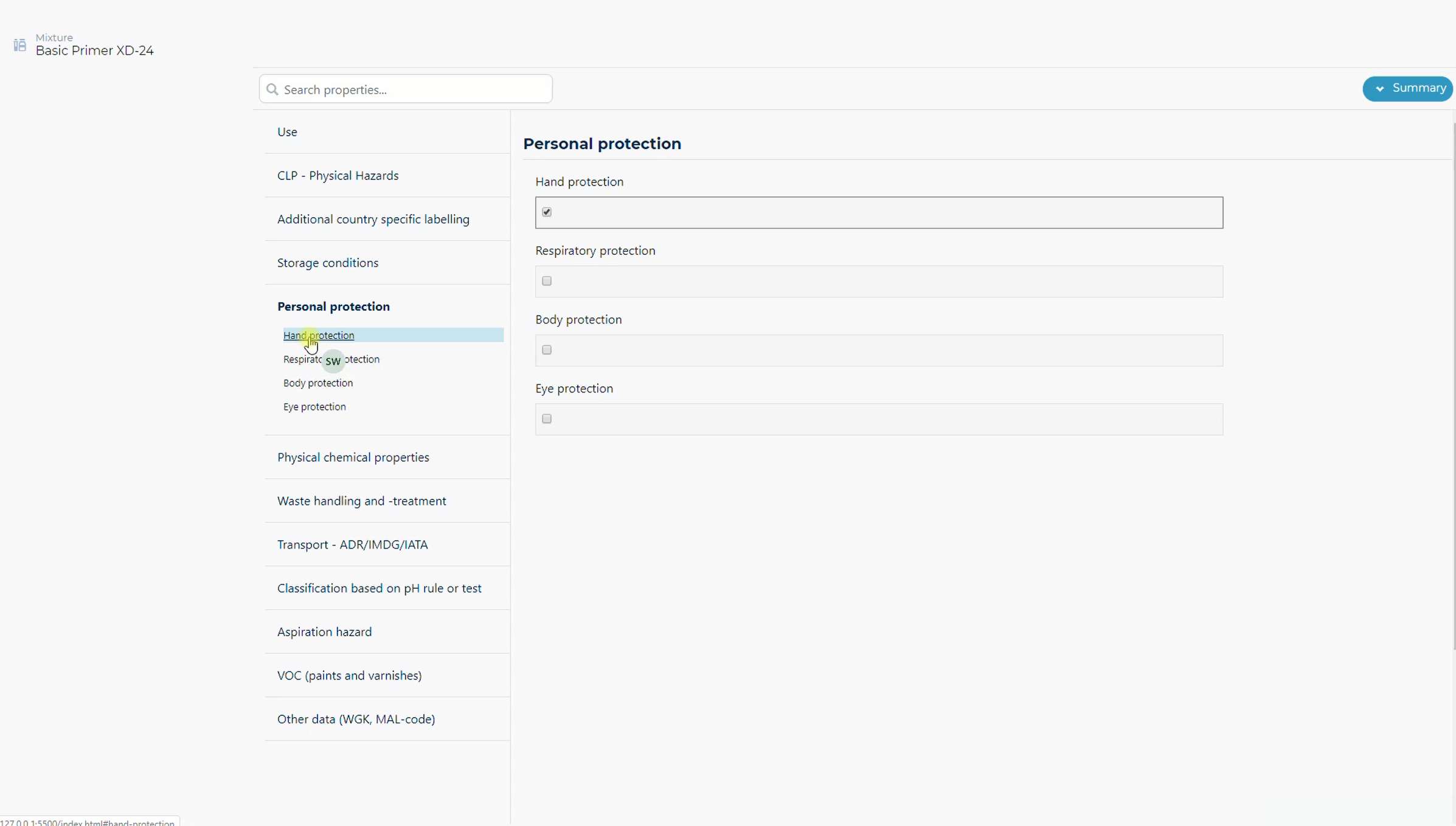
We're almost there...
Demo of a concept prototype close to the final design. To ensure a realistic representation of the data, I extracted the the actual setting labels, thus not using potentially misleading 'Lorem ipsum' dummy content.The prototype was used in user testing.
The Solution
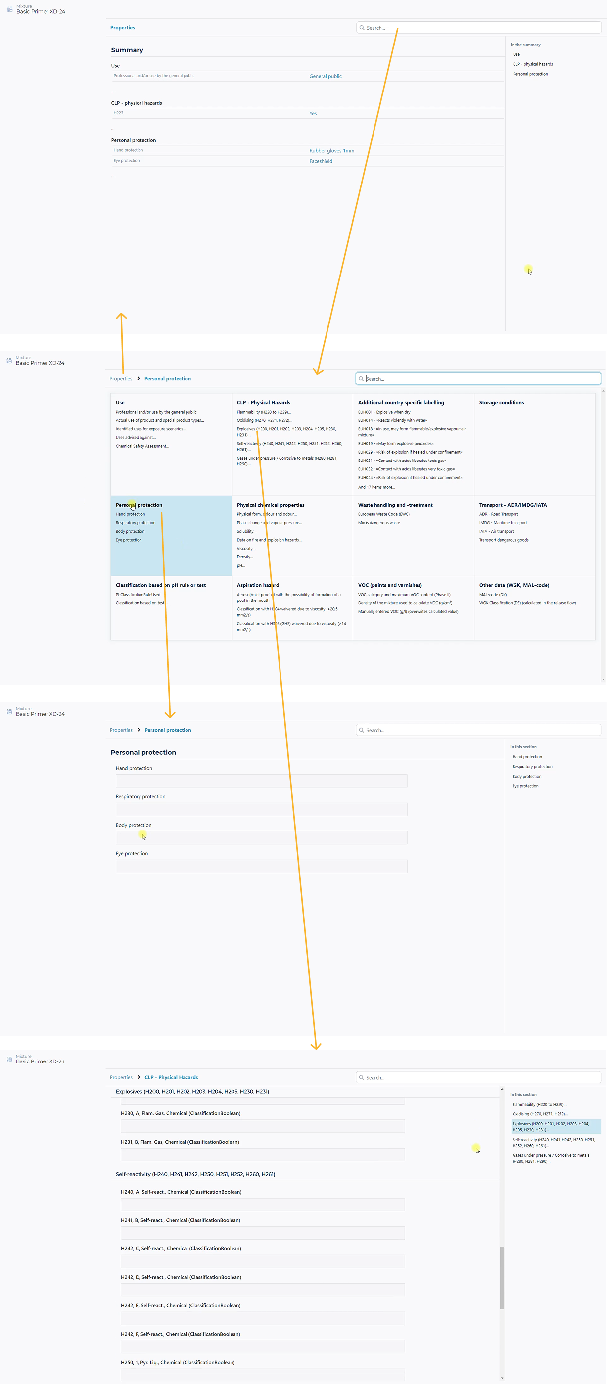
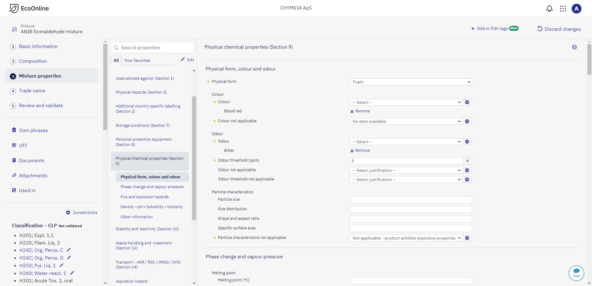
After redesign: Stricter structure, better navigation and surfacing properties
The redesign was a more compact layout featuring a navigation column (middle in screenshot below) showing only top-level sections and any immediate subsections, if applicable.Instead of organizing properties inside nested panels, I devised a strict structure with subheadings and consistent label indentation from the left (see right side of the screenshot) to visualize the hierarchy while a the same time surface settings.
Although the redesign introduced some redundancy compared to the original, it was an acceptable trade-off due to all the advantages it brought about.
Key benefits of redesign:
- Properties were easier to find (especially those deeper in the hierarchy)
- Users wouldn't get lost: Easily available you-are-here indicators in the navigation column and the clear indented tree structure
- A lot less clicking (and potentially scrolling): The collapsible panels were eliminated, settings surfaced and jump-navigation introduced
- Added search feature and 'Your favourites' filter (see below)
- In some cases the redesign would potentially result in a bit more scrolling compared to the old design, however, that was countered by a more compact layout and subheading jump-links
Compare with original design above.
Concept of 'Your favourites' to keep settings manageable
To further help users retain an overview and keep the number of settings manageable, we devised a concept of Your favourites.Since only certain settings are relevant to certain chemical industries or products, users could toggle individual sections, thus hiding properties not relevant to their situation.
In addition, the feature could be used as a tailored list of shortcuts to the most frequently used settings.
Demo of final property panel design
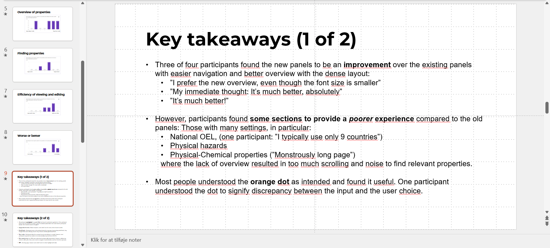
Orange dots indicate properties where values are edited by the user/differ from the default settings. Blue hover highlights aid the user in pairing the label to the pertient setting.Test results: 3 of 4 happy users
Results from a small test and survey with four users. Regarding some sections of the new design providing a poorer perceived experience: The search feature and the 'Your favourites' pinning and filtering concept (illustrated above) could help alleviate these issues.