Open to work I'm available for new UX design positions and projects — either remote/hybrid or located near Aarhus, Denmark.
How I can help Download resume Get in touch

Almego Document Management

Users met an inefficient document interface, appearing simple at first, but cumbersome in practice.

Through design I helped transform Almego's document management into a streamlined, well-organized system with versatile search and filtering, powerful bulk generation and quick access to the most recent, relevant documents — greatly improving efficiency and adoption, paving the way for earning higher subscription fees.

  • Tags

  • Product

    EcoOnline Almego
  • Domain

    Web app for creating chemical safety and compliance documents
  • Design task

    A complete redesign of the document management feature
  • My role

    Sole inhouse UX designer on small dev team
  • Years

    2020

Challenge

The end result of working in Almego is a number of PDF documents — mainly Safety Data Sheets (SDS) — generated by the system engine from compiling and processing the chemical product information, rules and regulations, document templates, text translations and much more.

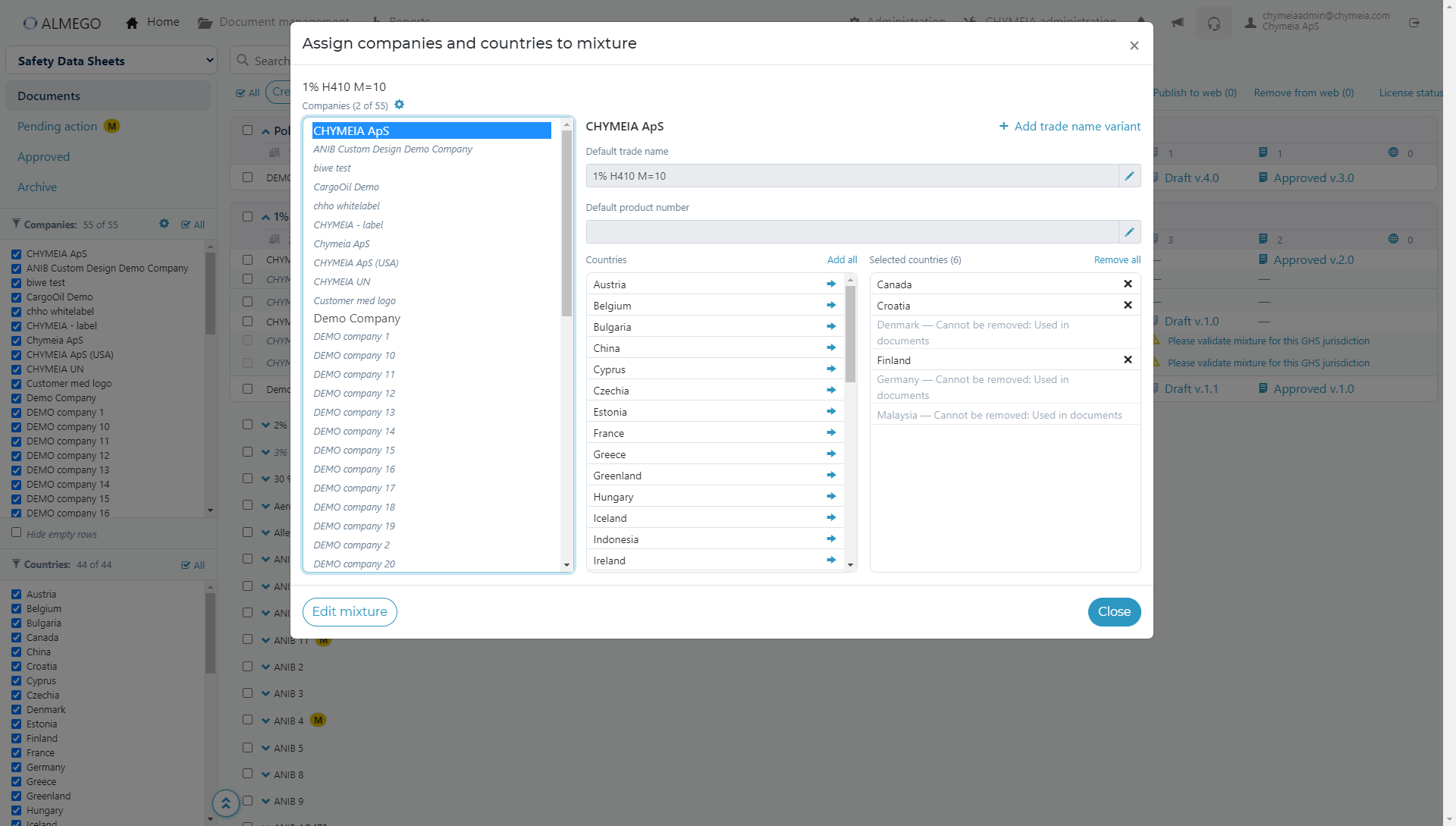
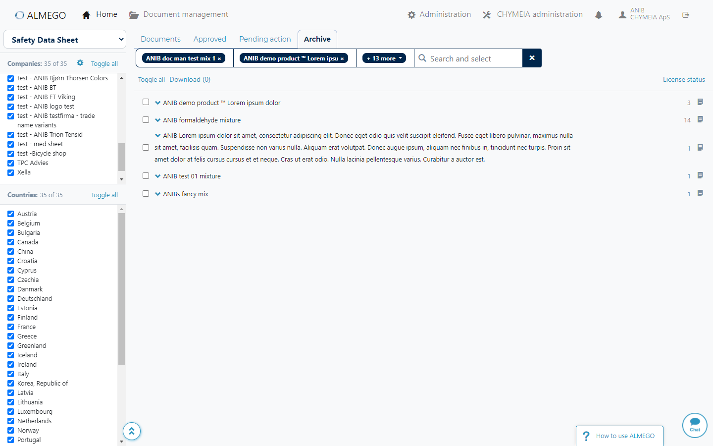
For each chemical product there can be a number of language and country versions of the same document as well as any number of brand names (i.e. the same product can be sold under different brand names). A document can be in different states, in particular Draft and Released (later called Approved). It can also be Published to external integrations. Furthermore, after editing the chemical data new document versions can be generated ad hoc.

Pfeww, clearly, there was a lot of documents for users to keep track of…

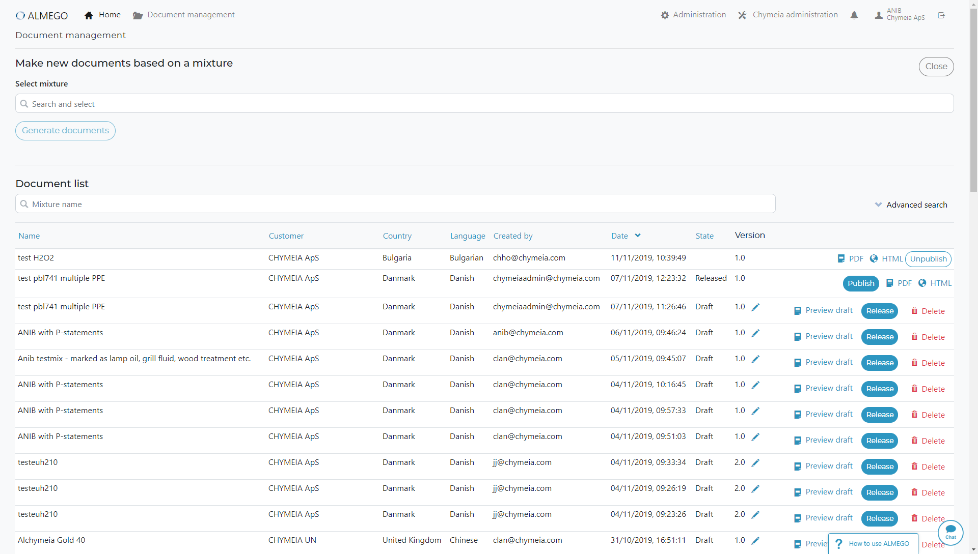
The old user interface consisted of a single big list of generated documents, across all products, countries, languages and brand names – and in all stages of Draft, Released or published. While there was basic substring search, column sorting and attribute filtering, this list was just overwhelming and inefficient to use.

To add new documents (or versions) to the list, the user had to use a separate part of the UI to search for a single product, choose a single brand name and then choose from a list of available countries and their languages — and then click Generate documents to get the Draft versions.

The document management feature is obviously very important to users, since the final documents are what they actually need. But the feature is also very important to the business, since only Released (not Draft) documents count towards the subscription tier. So, to earn higher subscription fees, we needed to make it much easier for users to generate a lot of Released documents, quickly. Simply put, we needed to greatly streamline the user flow.

Process

As a first step after kickoff, I conducted an internal survey asking questions such as:

  • What works well/doesn't work so well in the current design?
  • Please describe an optimal workflow for a redesigned document management?
  • What are the most important properties of a redesigned document management?

I also did a number of user interviews to help understand current workflows and pain points.

As part of the process I analyzed the existing UI. From all these data, the most important design goals materialized, in particular:

  • Make it much easier and quicker to generate Drafts and Released documents, also across products and brands, in bulk. Consider the typical cycle of going back and forth between editing data and generating drafts to see the changes
  • Provide a much better organization to make it easier to find relevant documents (i.e. the most recent Drafts and Released versions), and thus remove the noise of irrelevant documents

Then I got to work with the concept development, sketching screens and flows and prototyping interactions. Along the way I did a number of usability tests as well as stakeholder reviews.

Outcome

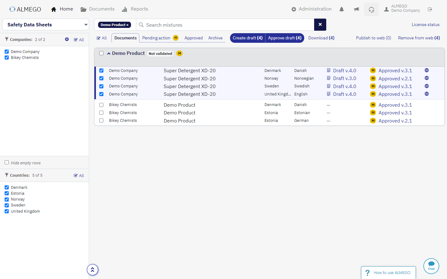
The final design was a big improvement, allowing users to quickly find relevant documents and generate new Drafts and Released versions in bulk across products, brands and countries. When put into production, the new design was well received by customers and internal consultants.

At first glance, the new design seemed more complex than the old one, so the sales team felt they needed to add a disclaimer for leads and customers: while it might look busy initially, after a short learning curve it would prove far more efficient.

Before redesign: At first glance a straightforward and usable design. However, in reality, the single big list with a mix of documents for all chemical products, customers and countries – and in all stages of Draft, Released or Published didn't work so well. To add new documents, you'd search for a mixture at the top, choose languages and then generate those drafts. While the list could be searched and filtered, it proved to be quite overwhelming and inefficient. Compare with redesign below.
<strong>Before redesign:</strong> At first glance a straightforward and usable design. However, in reality, the single big list with a mix of documents for all chemical products, customers and countries – and in all stages of Draft, Released or Published didn't work so well. To add new documents, you'd search for a mixture at the top, choose languages and then generate those drafts. While the list could be searched and filtered, it proved to be quite overwhelming and inefficient. Compare with <a href='#almego-document-management-create-documents'>redesign below</a>.
VIDEO: Key concept discovery — It was quite a Heureka! moment, when I came up with the winning concept meeting our design goals (more efficient document generation + easier to find relevant documents): Each chemical product (also called mixture) would be inside a (collapsible) panel. Further grouped inside were companies and their brand names for that particular product. Each country+language version of the document would constitute their own row, sorted A-Z.

And the really clever part? Each row would always link to the most recent Draft and Released versions of the document in their dedicated row cell 😁 Thus the same document would always live in the same place, not be hidden somewhere deep inside a giant list of all documents ever produced. An organization like that also better mapped to some users' mental model of a 'working draft' (like a Word document being continuously updated).

Furthermore, this design allowed us to provide easy filter mechanisms — and bulk operations, allowing users to select multiple rows and perform actions such as Create/Update, or Release directly from the toolbar.

The concept is demonstrated in this screen recording from a set of click-through wireframes.
Adding new document rows: While the concept above is very efficient for existing documents, the design for adding new documents — with no prior existing versions — proved more tricky to get right. It took several design iterations to arrive at a solution which was both easy to understand and efficient to use. The final design allowed users to open a modal window and add customers/brands and countries (with preconfigured languages) to a product to get pristine rows for generating new documents.
<strong>Adding new document rows:</strong> While the concept above is very efficient for existing documents, the design for <em>adding</em> new documents — with no prior existing versions — proved more tricky to get right. It took several design iterations to arrive at a solution which was both easy to understand and efficient to use. The final design allowed users to open a modal window and add customers/brands and countries (with preconfigured languages) to a product to get pristine rows for generating new documents.
Search and deep-linking: As part of the concept, we provided the ability to search for multiple products, generating a unique link to that particular view. That also allowed us to deep-link from a particular product's chemical data page directly to its pertaining documents, something we couldn't do in the previous design. This enabled users to quickly switch back and forth between editing data and generating new drafts to see the changes.
<strong>Search and deep-linking:</strong> As part of the concept, we provided the ability to search for multiple products, generating a unique link to that particular view. That also allowed us to deep-link from a particular product's chemical data page directly to its pertaining documents, something we couldn't do in the previous design. This enabled users to quickly switch back and forth between editing data and generating new drafts to see the changes.
After redesign: The final design met our design goals (make it much quicker to generate Drafts and Released documents, also across products and brands + make it easier to find relevant documents), and while quite dense, it was highly structured and powerful in use. It was well-received, and has no doubt contributed to our high user satisfaction ratings of 4.5 of 5. Compare with original design above.
<strong>After redesign:</strong> The final design met our design goals (make it much quicker to generate Drafts and Released documents, also across products and brands + make it easier to find relevant documents), and while quite dense, it was highly structured and powerful in use. It was well-received, and has no doubt contributed to our high user satisfaction ratings of 4.5 of 5. Compare with  <a href='#almego-document-management-before'>original design above</a>.
Open to work I'm available for new UX design positions and projects — either remote/hybrid or located near Aarhus, Denmark.

Related cases


View all portfolio entries