In my previous post – through a number of prototypes – I explored how to create zoomable responsive pages on mobile. The purpose was to quickly provide users with a bird's-eye view of content for them to easily (re)find the information they needed.
The approach, I would claim, was promising, however a bit unconventional.
In this post I take a step back from the unconventional and have a look at how an existing interaction pattern for providing a better overview of mobile pages can be tweaked and thus improved.
Collapsible panels
The interaction pattern in focus here are collapsible panels on mobile. That is, a number of consecutive vertical panels where content can be expanded and collapsed as the user clicks/taps the panel headings.
A prime example of collapsible panels is Wikipedia on phones:
The collapsed panel headings are great for initial overview. However, when multiple panels are expanded, maintaining that overview for e.g. (re)finding specific information becomes increasingly difficult.
Improving collapsible panels with a dual action button
To mitigate the risk of being lost, you could apply a simple idea, not exactly rocket science, yet I haven't seen it in use anywhere: Combining a back-to-top link and a collapse-all action in a single sticky, non-scrolling button.
This would be a case of an "emergency exit" described in the UX heuristic User control and freedom (NNGroup).
It could work as demonstrated in this prototype:
In the demo prototype above, only three panel sections are displayed. But it's clear that the higher the number of collapsible panels and the longer the content in each panel, the more of a benefit the combined back-to-top and collapse-all button is.
Further tweaks with gradients hinting position in long panel contents
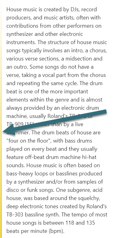
When scrolling through long expanded panels, the user's sense of context and position can be further supported. Visually, this could be a vertical gradient line spanning the entire length of each panel. As supplement to a page-wide scrollbar/indicator, this works on a more local panel level. Moreover, each panel could have a different color coding to help distinguish them, when scanning quickly through content:

If you want to try the prototype demo for yourself, download the app ProtoPie Player on your iPhone or Android phone and open this prototype file.
View this guide to ProtoPie Player if needed.