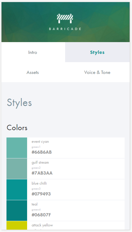
In the Barricade style guide the navigation options are rather ambigious on small screens (see "Before" screenshot below): It is hard to tell which is the current option and if the options are hierarchically organized or at the same level.
Before:
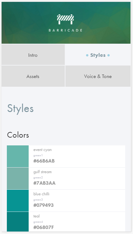
After quick redesign:
Try it out yourself in Google Chrome:
- Get the Stylebot Chrome extension
- Go to styleguide.barricade.io/
- Open Stylebot and click the "Edit CSS" button
- Paste in the following CSS and click Save
- Resize the browser window to mimic a smartphone screen
/***********************************************************
   Created by Andreas G. Ibsen, agib.dk
   ------------------------------------
   Go to https://styleguide.barricade.io/
   Then try paste this CSS into Stylebot Chrome extension:
***********************************************************/

@media screen and (max-width: 60em) {
  .styleguide .sidebar ul.side-nav .heading {
    outline: 1px solid oklch(0.9037 0 0);
  }
  .styleguide .sidebar ul.side-nav li.active a {
    background-color: oklch(0.9702 0.0041 271.37);
  }
}

@media screen and (max-width: 40em) {
  body .styleguide .sidebar ul.side-nav li.heading,
  body .styleguide .sidebar ul.side-nav li.heading:hover {
    background-color: oklch(0.9037 0 0);    /*oklch(0.397 0.0444 249);*/
    color: oklch(0.6487 0.0301 225.97);
    outline: 2px solid oklch(0.9702 0.0041 271.37);
  }
  body .styleguide .sidebar ul.side-nav li.heading a {
    color: oklch(0.3211 0 0);
  }
  body .styleguide .sidebar ul.side-nav li.active a {
    background-color: oklch(0.9702 0.0041 271.37);
    color: oklch(0.6487 0.0301 225.97);
  }
  .side-nav .active > a::before, .side-nav .active > a::after {
    opacity: .35;
    content: "●";
    color: oklch(0.5998 0.1202 230.47);
  }
  .side-nav .active > a::before {
    padding-right: .25em;
  }
  .side-nav .active > a::after {
    padding-left: .25em;
  }
}